Bloom
About
This is a student project from my graduate program.
Bloom is a concept product focused on providing easy-to-read results and improved understandability of blood tests.
Year
2019
Responsibilities
Visual Design, Product Design
The Brief
Create a better user experience for blood results; focus specifically on the results themselves.
This open brief was given by my instructor who works for a health-tech company in the Bay Area –he gives the same challenge to potential applicants. The brief required us to create our concept product and we were encouraged to design around an audience of our choosing.
The Problem
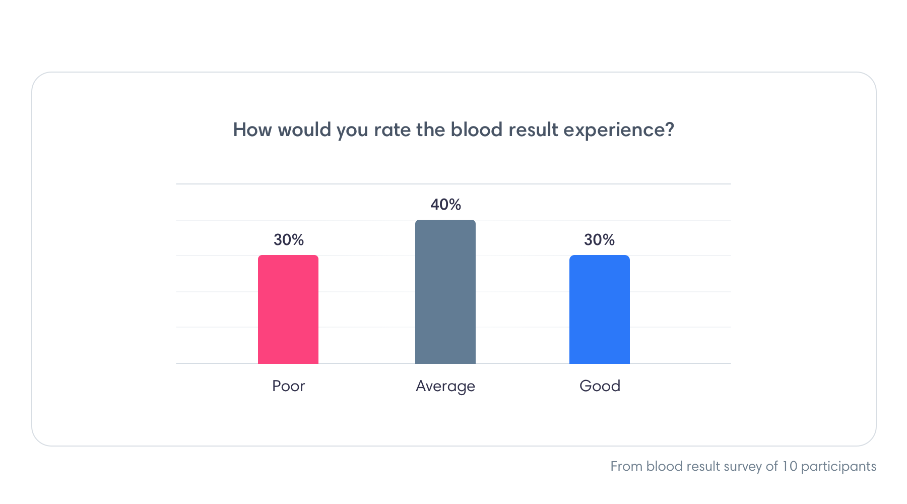
30% of users rated the understandability of blood test results as poor and 40% as average. Blood tests results are medical documents designed for health professionals, not patients. They can be technical and confusing to the average user.
The Research
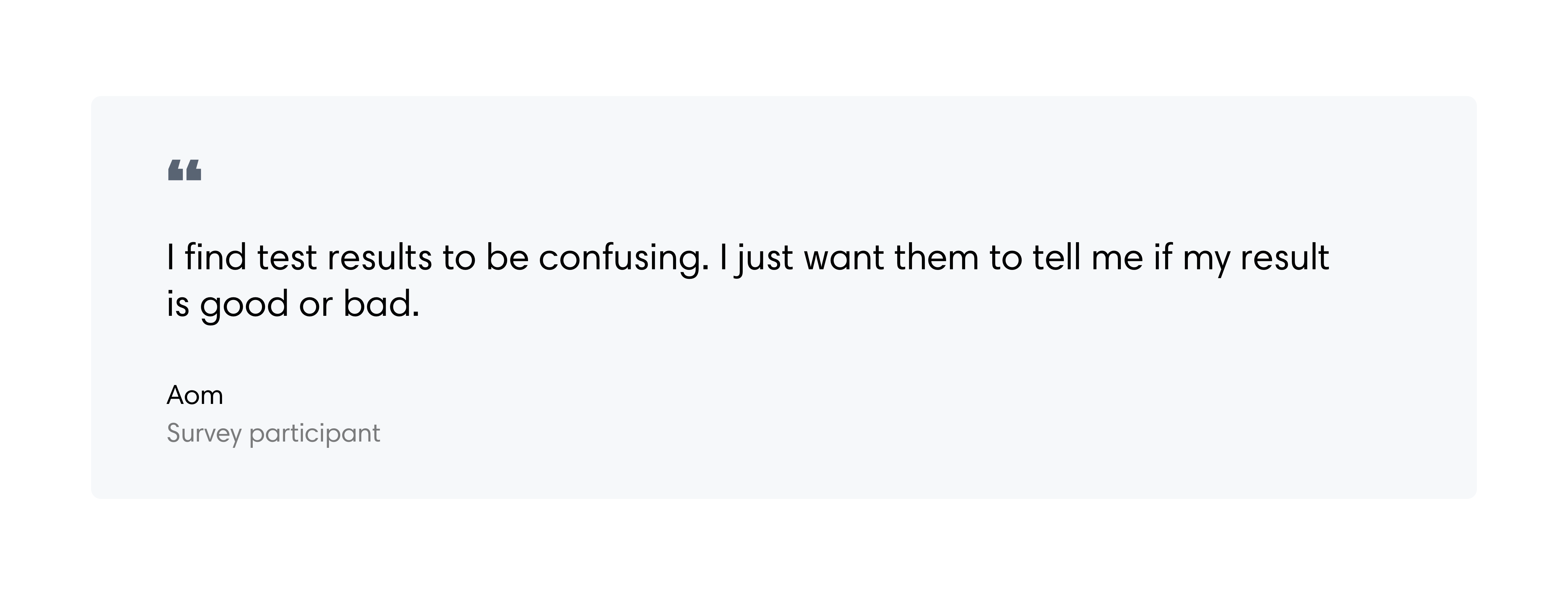
I created a survey to understand how people felt about blood test results; a total of 10 people participated. We discussed issues that they have with results and I observed them looking at one of my blood test results during the interview to see pain points live. Afterward, they filled out a short questionnaire.
Bad news first
90% of users look for abnormal results upon first viewing. Users scan for results that need immediate attention.
Tell me what's going on
If a result is abnormal users want to know what to do next. A majority of users want their results to tell them in plain English if a result is bad or good.
Visuals provide context
Results showed that users wanted better visuals to help make sense of their results. Using a combination of layman terms and visuals can provide better context.
The more information, the better
Users want as much information as possible to help them make smart decisions. Research showed that users want explanations with their results to give context.
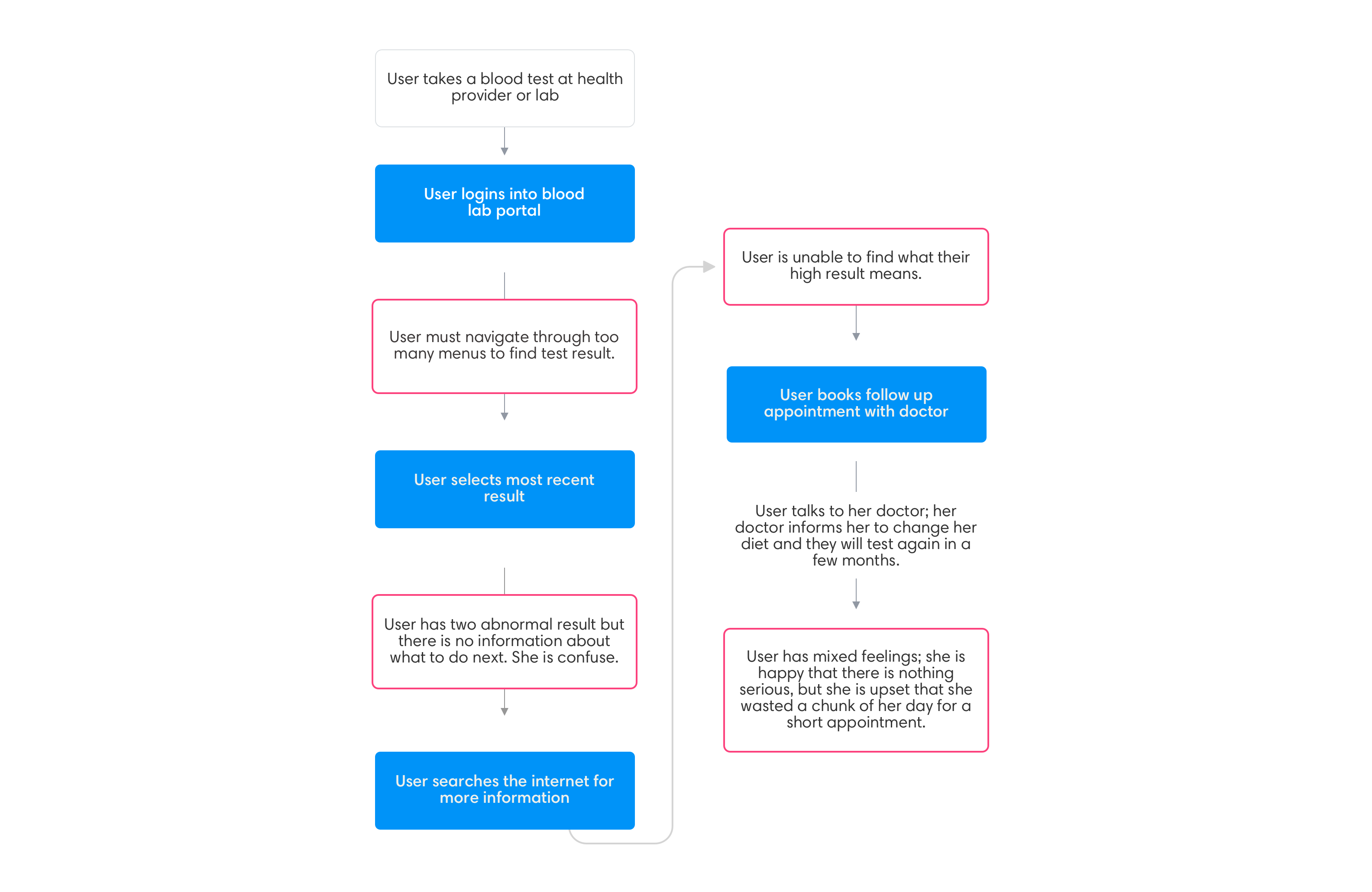
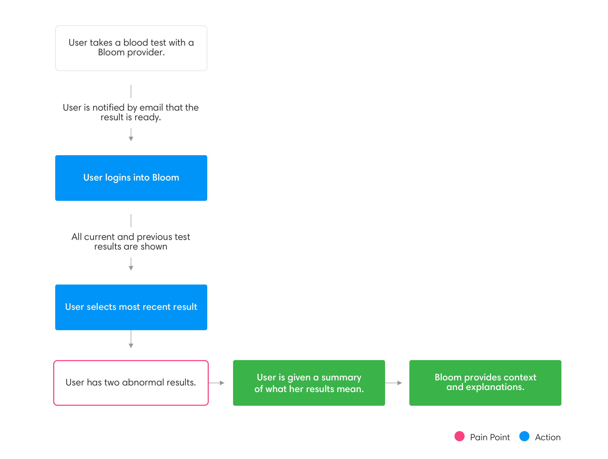
The Experience
A typical journey can look like this:
New experience:
The Wireframes
Using my blood results as inspiration I visually explored various ways to better showcase results. I looked at various healthcare dashboards for inspiration and referenced my healthcare provider. Creating wireframes for me, especially in conceptual projects, is about ideating and exploring various solutions.
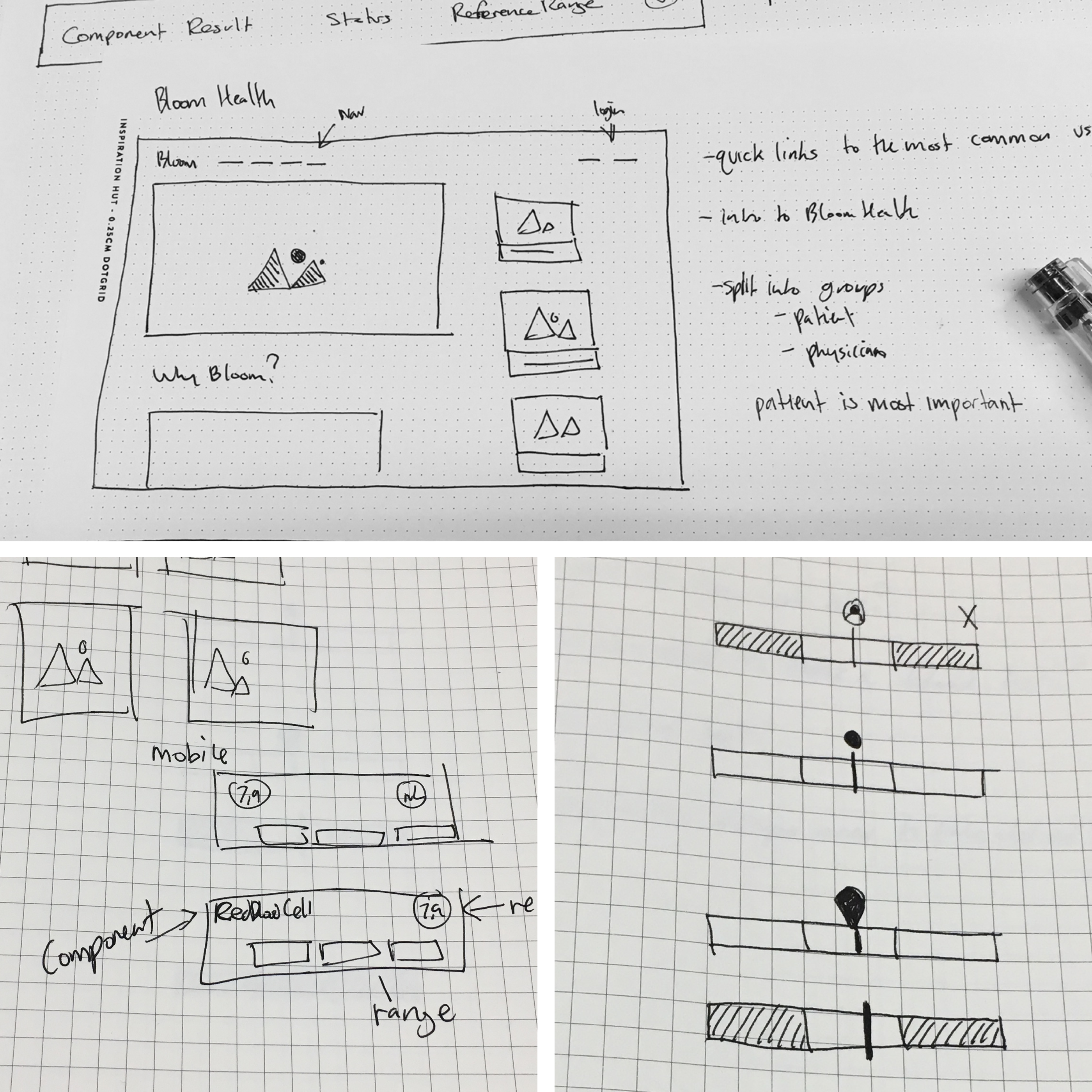
Trying to figure out how to design the reference range
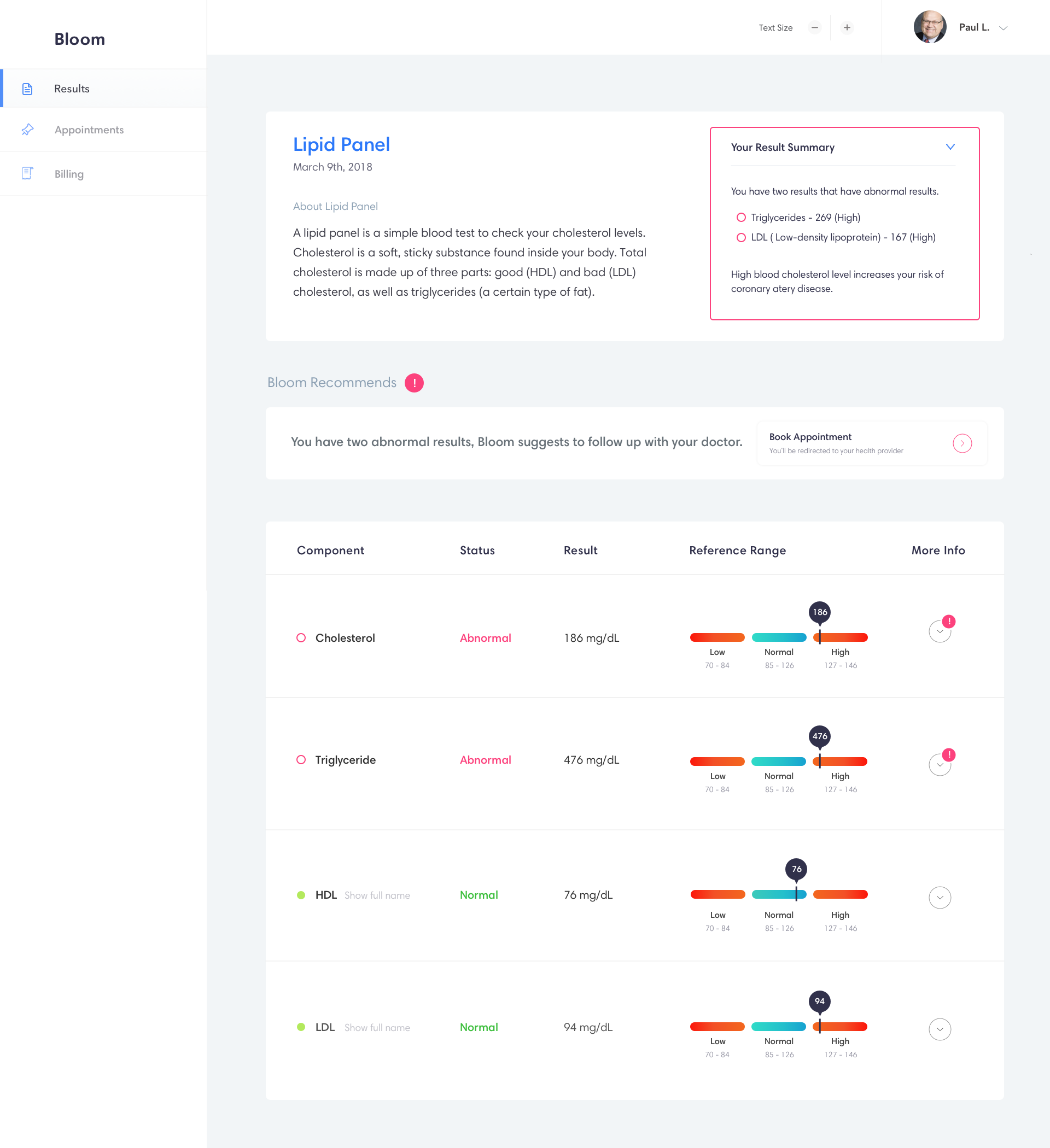
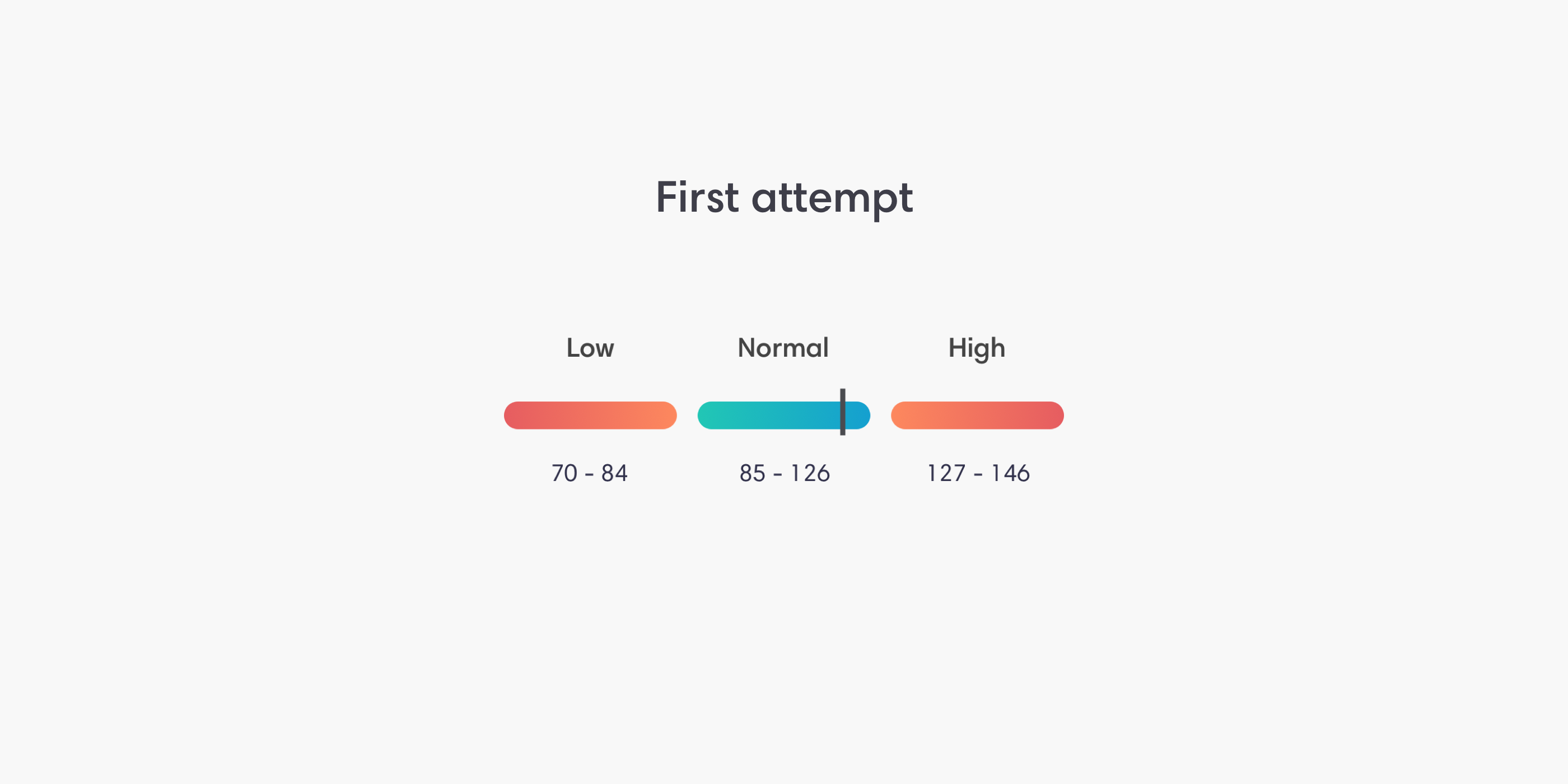
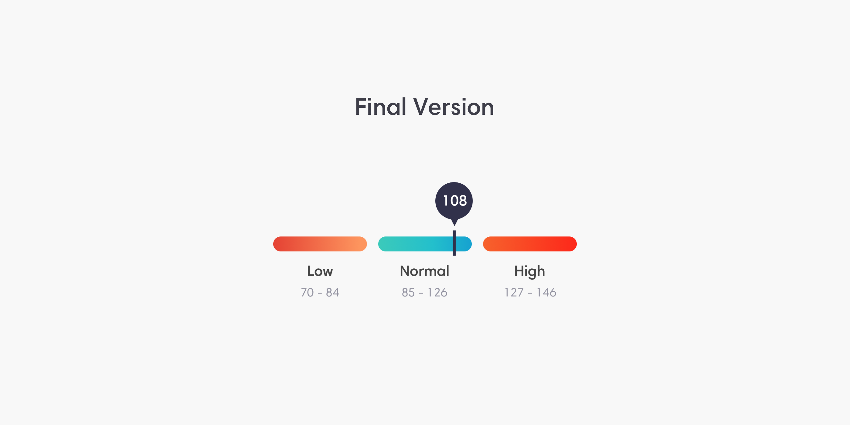
The Reference Range
The reference range works in tandem with the result value, it helps clarify where in the spectrum patients fit. In existing blood tests these are provided in different ways but Bloom uses a system designed to neutralize any confusion.
Early testing showed users understood the reference range but wanted a more precise indicator. There were also complaints about it being hard to find.
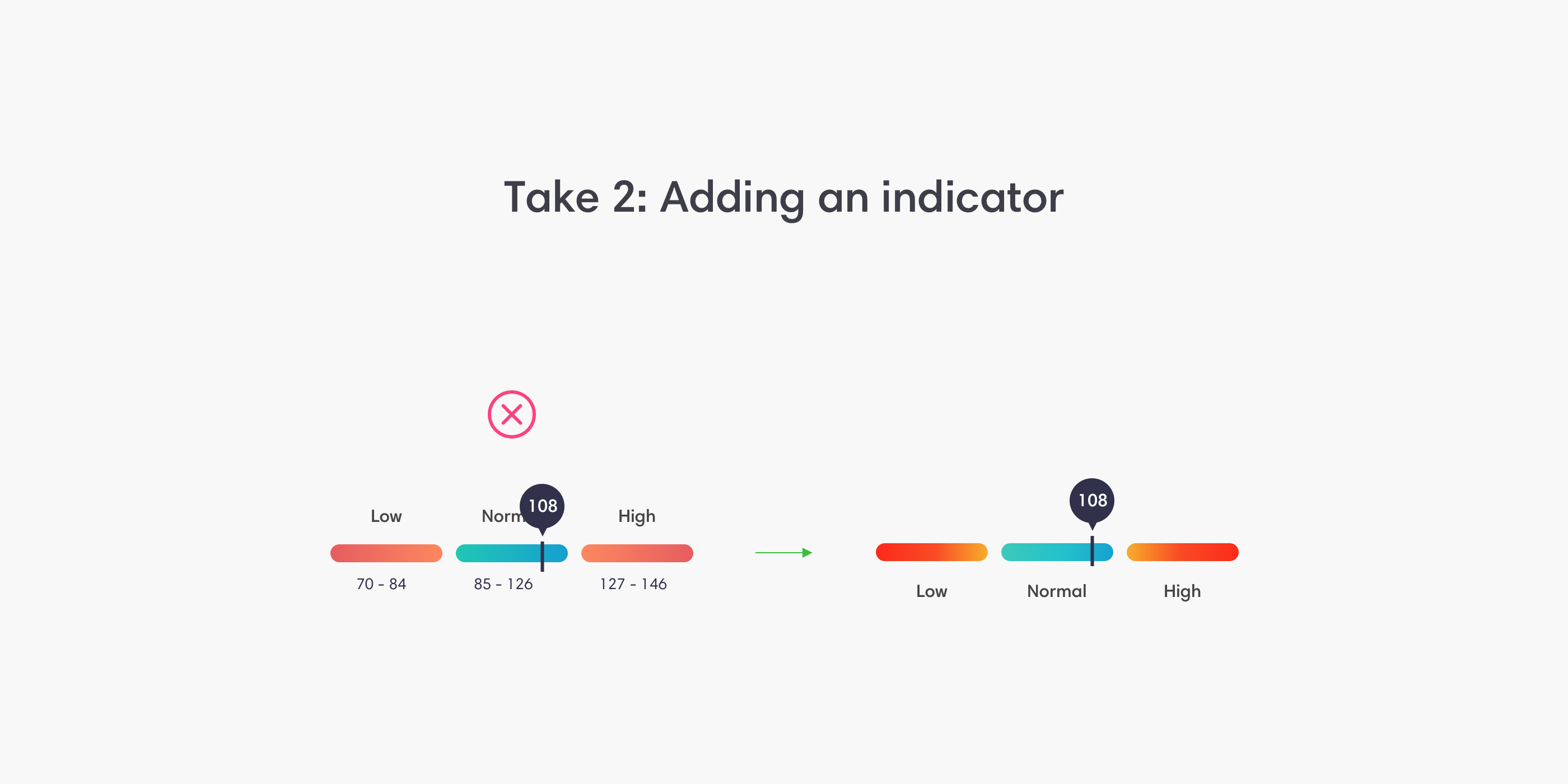
The addition of the indicator into the segments blocked the details so I decided to remove them to avoid colliding with the indicator. However, a majority of users remarked about the location of the numbers! I didn't realize how much users desired the numbers so I put them back in a better location than didn't block any visuals or info.
The Final Design