Loan Approval Guide
I spearheaded the design of a new feature aimed at helping users understand why they were declined for a loan. Through our project, we confirmed our hypothesis, resulting in a notable 17% engagement.
Company
Credible
Year
2022
Role
Product Designer
Responsibility
Visual Design
User Experience
Content Writing
Research
The Context
Moving teams
In January 2022, our Chief Product Officer asked my product manager, Emily, and me to move to a new team. We were tasked with the responsibility of restarting the Retention team, which had been on 6-month hiatus, with a focus on improving Customer Lifetime Value. I was excited to return since I had previously launched two 0 to 1 features there.
We were given a small window to select projects and expected to start working as soon as possible. Luckily there was an existing backlog. My product manager and I reviewed and discussed potential projects for the upcoming quarter. There was one problem on the backlog that instantly caught my eye.
The Problem
50% of users who apply for a loan at Credible are declined
That's roughly 80,000 declines per month! I was shocked when I learned how substantial the decline rate was. When users are declined, they see this screen:
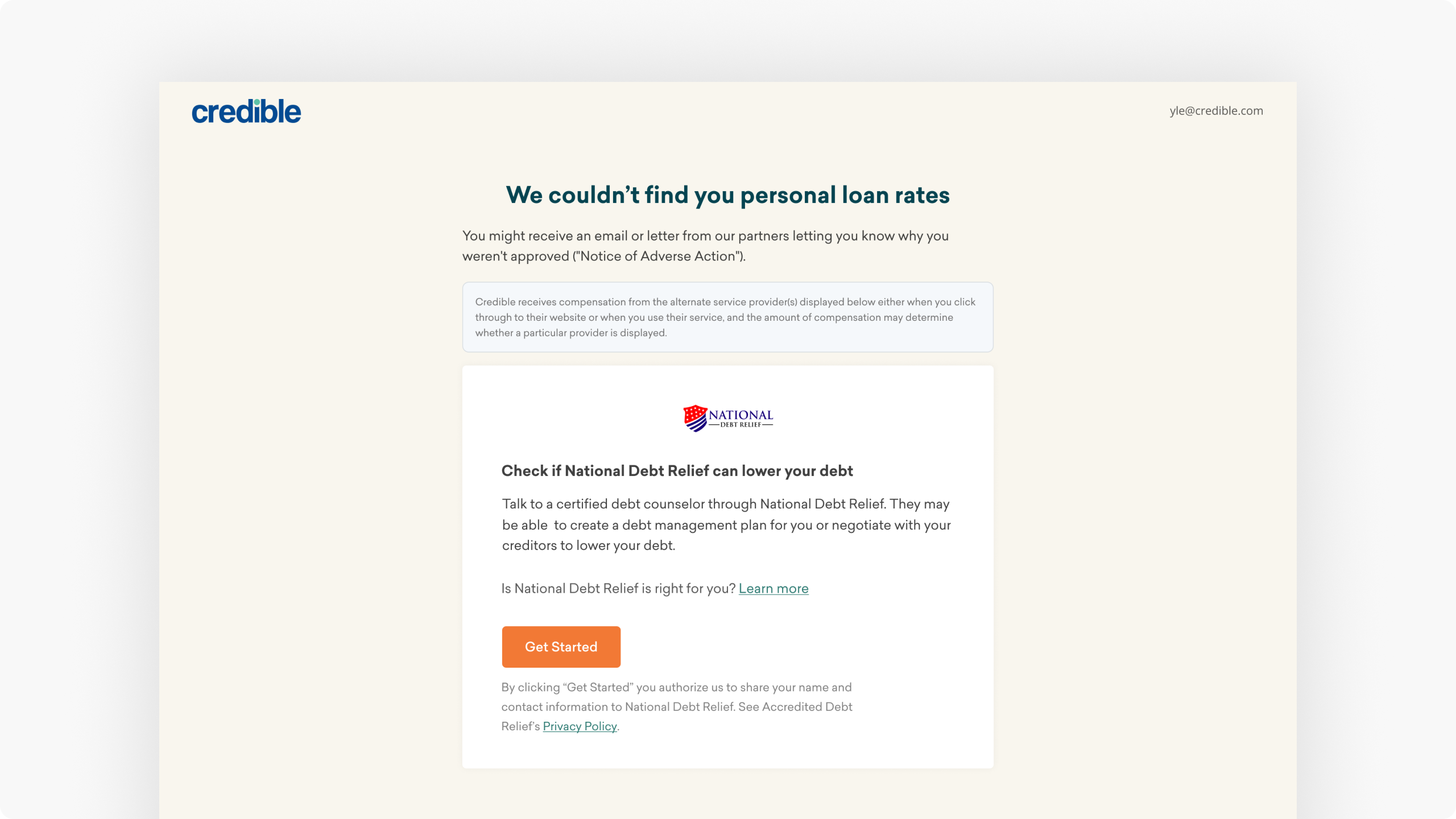
What users see when they are declined for a loan
Why so many declines?
My product manager and I met with the PM for Personal Loans and learned the two main reasons for declines:
1. Low credit score. An applicant’s credit score is one of the most important factors a lender considers when evaluating a loan application.
2. High debt-to-income. Lenders use this to predict a prospective borrower’s ability to make payments on new and current debt.
71.7% rated the page as “not at all helpful”
I launched an in-product survey to understand how users felt after getting declined. We received over 400 responses! Unfortunately, an overwhelming 71.7% of users found this page unhelpful.
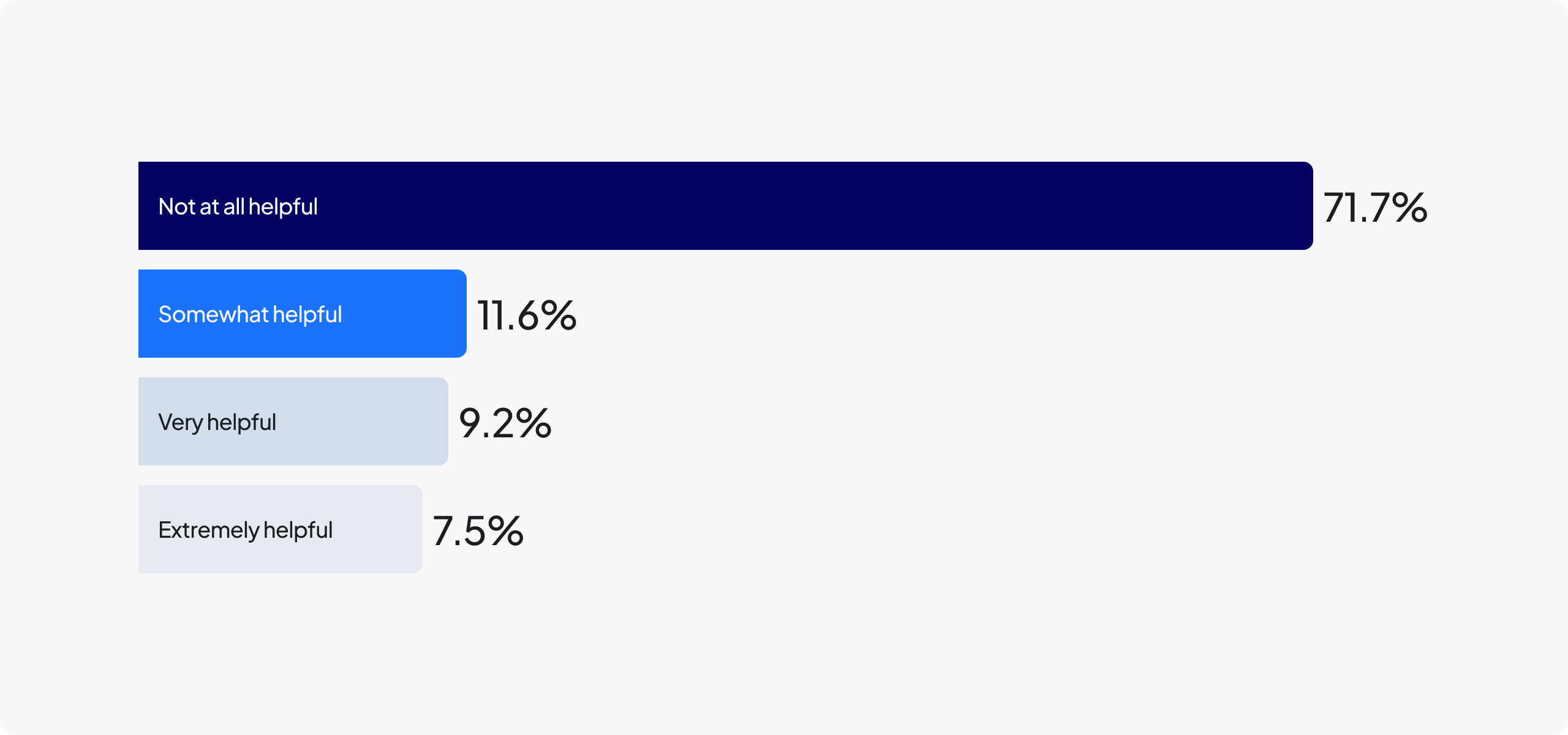
Survey results from decline screen
The Opportunity
Help declined users get approved
My PM wrote an opportunity statement for this project: “We believe creating a coaching experience for declined users can improve their financial well-being and lead the user back to Credible." In short, our goal was to help declined users get approved for a loan.
From a business perspective, it's in our best interest to approve users, as declines mean missed revenue opportunities —we only profit when users successfully close on a loan. To achieve our goal I suggested creating a minimum viable product to gauge user interest and validate the potential value of this idea.

Simplified diagram of proposed solution

Design documents I create before I start designing
The Research
Users don't understand approval factors
When I implemented the in-product survey, I also included an option for users to provide comments, and to my surprise, it received over 100 user comments. After reading the comments, one of the most important takeaways was users have a poor understanding of approval factors.
Users often boasted about their high income while neglecting other approval criteria. One declined user said, "I have FICO scores of 800-850. Are you guys crazy?" This highlighted the fact that some users were seeing approval as one-dimensional.
The Stakeholders
Getting alignment on MVP
We knew early on in the project that we weren't going to fully solve the problem in one go. To help declined users a significant focus would be helping users improve their credit scores. However, improving your credit isn't something you better overnight. Instead, we broke the projects into phases and focused on smaller goals for the MVP.
We presented to our CPO and discussed our goals for the Loan Approval Guide MVP:
1. Tell the user the minimum credit score to get
approved
2. Educate the user on approval factors
3. Provide decline reasons

Brainstorm session with 2 Product Managers and Research
The Explorations
Figuring out how to educate users
One of our goals was to educate the user on approval factors so my next explorations focused on educating the user about the approval process but it was extremely text-heavy.
In some of my explorations, I wanted to highlight to the user the difference between their current credit score and the minimum score required for approval. My goal was to help users understand the extent to which they needed to increase their score.

Early wireframes
“This isn't novel or creative.”
The rough due date for turning in final designs was approaching. During a critical design review, our Chief Product Officer gave me candid feedback that the designs weren’t novel or creative. It was a low point.
Hi-fidelity design concept that I shared with my CPO
The Final Design
The AHA moment; an interactive quiz
After that meeting, I realized that my early designs were lacking in inventiveness and delight. I shifted my approach, stepping away from simply expecting users to read for value, and instead opted for a more interactive experience. I presented the page in the format of a quiz.
To help users get approved I believe we first needed to help them understand why they were declined in the first place. Each section would focus on an approval factor.

Final design of Loan Approval Guide MVP
The Prototype
Mitigating risk with user testing
Before the launch, I worked closely with our researcher to come up with a test plan. I drafted an initial set of questions and she helped me refine them. I then proceeded to conduct tests on both the existing concept and the new interactive one I had developed. I launched an unmoderated user test with ten users.

The test plan I created with Research and my post-interview notes
The Launch
17% of users clicked into the MVP!
Early in the design process, I made a decision not to remove the current decline experience. Instead, I added a CTA. This approach allowed us to gauge user interest by measuring deliberate clicks, thereby confirming whether users desired this feature.

Over 50% of users on the page are engaging with each content block.
Users were clicking and reading the content. Naturally, we saw credit score with the most engagement, likely due to position, (58%), followed by debt-to-income (55%).

Users found the content helpful!
Yes, ~117% more helpful thumbs up than thumbs down. This was a huge improvement over the original decline experience. This was a late addition and I was surprised that users were even clicking on this.

The Conclusion
Think big, start small
This was the first feature we launched after a 6-month break. Prior to that, my last retention feature was a disappointment, with only a 2% engagement rate. I'm particularly proud of how I managed the risks and developed a feature that enabled me to test my hypothesis before investing in a larger project.
This was a huge success for my team and more importantly, our users, by giving them an experience to help them understand why they were declined they were less in the dark. At the time of our launch, none of our competitors were offering this level of transparency.
Shortly after the launch, I transitioned to a different company, but I’m pleased to see the positive impact this project had.